Showing posts with label Product_design. Show all posts

3/08/2021

Camp Fire project

We made a prototype to visualize the 2018 Camp Fire, "the most destructive wildfire in California's history, and the most expensive natural disaster in the world in 2018 in terms of insured losses" [Wikipedia].

The Landsat pictures are stunning.
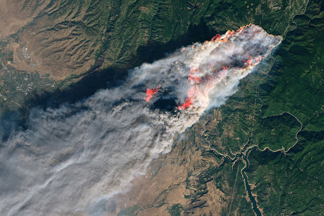
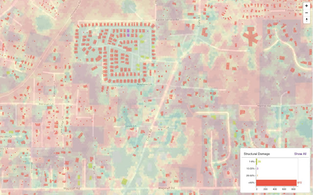
We needed a precise view of fire damage with vegetation fire index as a context.

The dataset is pretty big, but zooming and filtering on large dataset on maps is one strength of the OmniSci platform. So we can filter by damage level and zoom down to individual buildings.
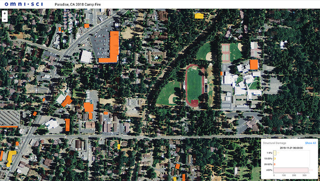
Switching to a sattelite basemap, we can see how much the shapefiles match the buildings. This tool could be used in rescue missions or even to prevent fires in the future by scheduling maintenance or turning off parts of the electrical grid in high-risk areas.
3/06/2021

Sankey from a Google Sheet

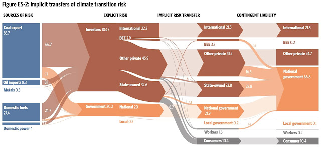
For a collaboration with the excellent information design firm Voilà, I needed to generate some fairly complex Sankeys. I made this example of a Sankey pulling data from a Google Sheet as a template to generate some of the visualizations from the report Understanding the impact of a low carbon transition on South Africa.


3/05/2021

SQL Editor redesign

Immerse SQL editor is very useful to test some queries, build views, etc. It needed a redesign. Here are some details of the redesign process.

We needed some new functionalities like:

  • Better syntax highlighting, autocomplete, SQL formatting and validation
  • Better table/column browser with filtering
  • Query history with preview data
  • Reusable query snippets
  • Run multiple queries in the same context instead of notebook-style
  • Notifications
  • Shapefile query results

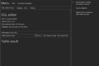
So after the phase of requirements gathering and research, we started wireframing.


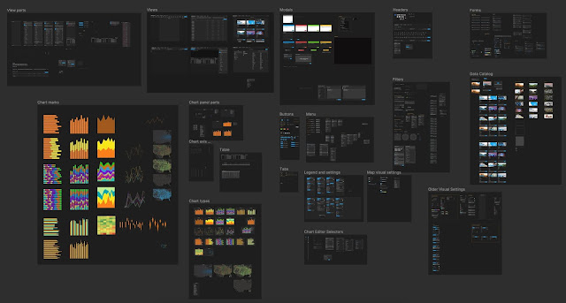
At OmniSci, we maintain a nice set of Figma components that we use to compose mockups quickly.


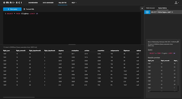
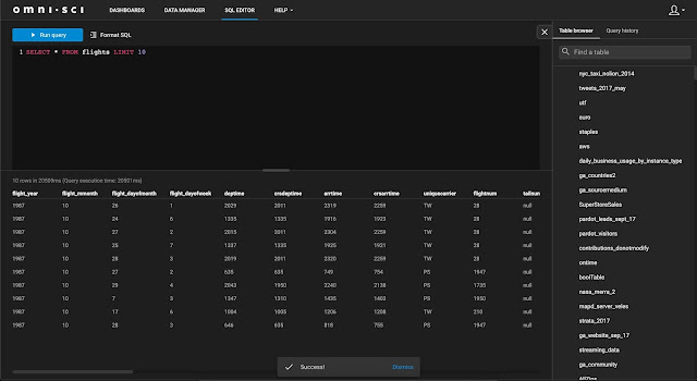
Here is the result of the SQL Editor redesign. 

Before:


After:


If you don't see a big difference, that's a good thing. All the barely visible features that facilitate editing, like key shortcuts, notifications, simplified flow, automatic formatting, validation, query history and snippets makes a big difference in usability without adding much cognitive load.

1/15/2021

Looking back at my 1st project as Product designer at OmniSci

I just celebrated my 3 years at OmniSci (formerly MapD). Looking back, my biggest highlight was to move from Frontend engineering to Product design. 22 years ago, the same year I founded my UX design company BioDesign, I started teaching programming, so I always had both interests. 

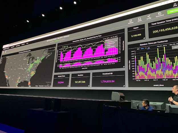
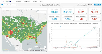
My first project in that new role was to convert the app to dark mode. I always vaguely dismissed the request for dark mode UI as a trend. But then I got a very specific use case: the condition for our app to be displayed on the giant screen of the NVIDIA GTC conference was that it needed to be in dark mode, light mode simply blasts way too much on these giant screens.

It was a Sunday and the conference was on the next day so no time for a new build. I wrote some javascript to run in the browser console to override the css on-the-fly. Here's the result:


I developed dark mode screens before, mostly for monitoring apps where users have to stare at it all day, to relax the eye. But my manager Christian Baptiste showed me how to use Material guidelines for dark themes which really added some structure to UI patterns I was mostly improvising until then. From there I developed Omnisci-ui, which is our in-house theme for RMWC, an excellent React Material library. We also developed, with Chrstian and my colleague Duncan lane, a set of reusable Figma components for our mockups to match our javascript components.


I still need to learn more facts about the benefits of dark mode. But at the end of the day, a big part of making our users successful is to make them happy. We delivered dark mode with the next release of OmniSci Immerse and it was a great success. So I have to thank a giant screen for forcing me to learn how to properly design dark themes.

6/01/2018

MapD3

I'm currently working on datavis for MapD Immerse and collaborating on a new charts library codenamed MapD3. It's in an early stage, but we are already using it in production and it's available on Github.


3/17/2017

Insights from designing Datahub UI

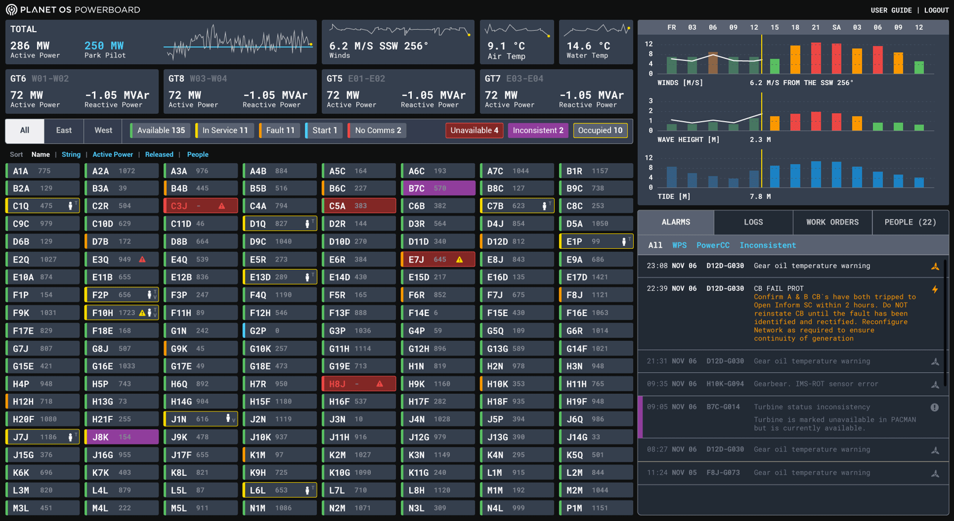
I wrote a blog post about some code architecture insights I got from building the visualizations for Datahub-ui, a ui platform we are using at Planet OS.


12/16/2014

Firespray: a streaming chart library

Working with Boundary (now BMC), I developed Firespray, a nice chart library for streaming data.


8/31/2014

Micropolar

I developed a polar charts library named Micropolar for Plotly, a visualization platform for science.

The visualization below is interactive!


See the Pen Micropolar demo by Chris Viau (@biovisualize) on CodePen.

4/25/2013

Datameer Designer

It's been almost a year since Datameer launched its 2.0 version, featuring a new Business Infographics Designer. Lots of polishing and improvements went into the product. Take a look at the documentation, not the best examples around :) but shows the diversity of chart types available.


6/25/2012

Datameer 2.0 visualizations

I worked on the new visualization system for Datameer 2.0 we just launched at Hadoop summit.


11/29/2010

FlowVizMenu


Visualisations multidimensionnelles pour l'exploration de graphe en bioinformatique présenté et publié à InfoVis 2010.

9/15/2009

Cubes Olap

Travail de recherche pour SAP Business Objects.

10/15/2007

Croissance de la plante

Interactif sur la croissance de la plante au niveau cellulaire