Immerse SQL editor is very useful to test some queries, build views, etc. It needed a redesign. Here are some details of the redesign process.
We needed some new functionalities like:
-
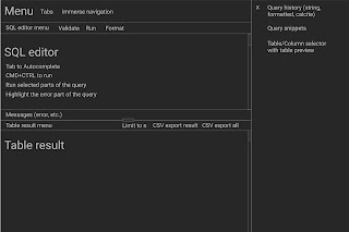
Better syntax highlighting, autocomplete, SQL formatting and validation
- Better table/column browser with filtering
- Query history with preview data
- Reusable query snippets
- Run multiple queries in the same context instead of notebook-style
- Notifications
- Shapefile query results
So after the phase of requirements gathering and research, we started
wireframing.
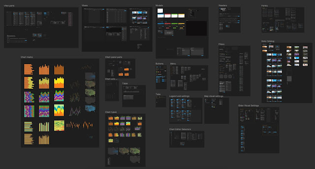
At OmniSci, we maintain a nice set of Figma components that we use to compose
mockups quickly.
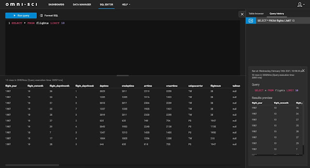
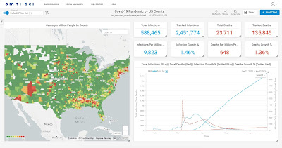
Here is the result of the SQL Editor redesign.
Before:
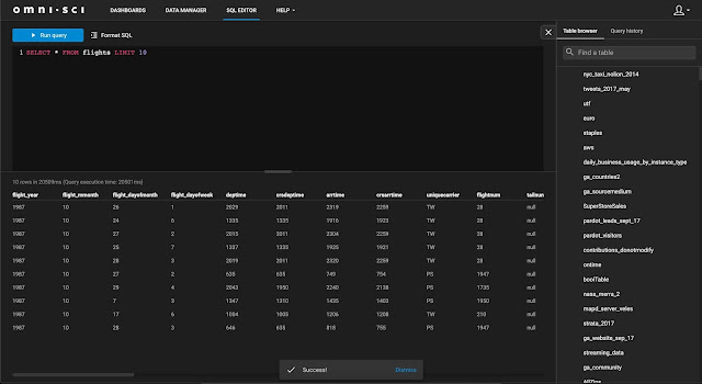
After:
If you don't see a big difference, that's a good thing. All the barely visible
features that facilitate editing, like key shortcuts, notifications,
simplified flow, automatic formatting, validation, query history and snippets
makes a big difference in usability without adding much cognitive load.